What follows below is a paper that I have written for submission to the UK’s Department for Business, Energy and Industrial Strategy. It examines the importance of Energy Return on Investment (ERoI) for advanced societies and suggests methods we can utilise to improve how we measure the quality of our energy sources. This paper was submitted today.
Executive Summary
Energy surplus is destiny. Our sources of energy must not only account for their own production costs but they must return sufficient energy to society for them to be of value. With surplus energy society can provide various services from employment, to healthcare, to entertainment. Having read both the Government’s Call for Evidence: A smart, flexible energy system and the Government’s Industrial Strategy: Green Paper I have observed an omission regarding energy quality. I would therefore like to explain the importance of energy quality, measured as Energy Return on Investment (ERoI), how it correlates with living standards and then offer suggestions as to how systems engineering should be utilised to address this oversight.
Contents
- Purpose
- Quality of Energy
- Why Should ERoI Concern Us?
- ERoI Data
- Sustainable Societies
- Alternative Measurements to ERoI
- Energy Systems
- Conclusion
1. Purpose
The purpose of this paper is two-fold;
- To inform the authors of UK Energy Policy as to the importance of energy quality and its relationship to living standards.
- To provide system engineering solutions to address some of the issues raised in this paper.
2. Quality of Energy
I have written this short paper to address a vital piece of the United Kingdom’s energy jigsaw that I believe has been omitted from the current dialogue – the quality of our energy sources. Recent media articles suggest a growing interest in both smart grid and smart city development. The Government has also recently issued a Call for Evidence on how best to implement a smart, flexible energy system. I believe the current initiative can be summarised as; “The Smart Grid aims to provide consumers with intelligent price signals to reduce the cost of electricity. At the same time it aims to provide the National Grid with an intelligent system balancing mechanism through Demand Side Response to avoid costs and fines.” Demand Side Response enables consumers to adjust demand in real-time which helps the National Grid soften both voltage peaks and troughs.
Complexities of this implementation aside, this paper shall focus on the quality of energy sources available to fuel any future power distribution system. I believe the envisaged power distribution system can be loosely shown as follows;
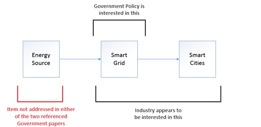
Figure 1 – Simplified Power Distribution System
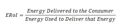
Having recently read both the Government’s Call for Evidence: A smart, flexible energy system and the Government’s Industrial Strategy: Green Paper I would like to raise a concern that hasn’t been addressed in either of the two papers – Energy Return on Investment (ERoI). ERoI is essentially a measure of the quality of an energy source, i.e. how many Joules are consumed in locating, extracting, refining, converting and delivering that energy source to a consumer compared to how many Joules are available to consume. It is presented as a ratio of the amount of usable energy delivered from a particular resource to the amount of usable energy consumed to obtain that resource. The difference is the surplus energy available to run an economy. It can be expressed as;
Several variations of ERoI exist depending upon how the boundaries are defined. For example;
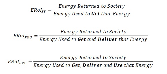
- Standard ERoI (ERoIST) is the standard ERoI approach that divides the energy output of a project by the embedded on-site energy costs (e.g. operating and equipment). However, it does not include the refinement, transportation, supporting labour or financial services costs.
- Point of Use ERoI (ERoIPOU) not only includes ERoIST but also includes refinement and transportation energy costs to the point of use.
- Extended ERoI (ERoIEXT) includes all of the above plus the ability to actually use the obtained energy, e.g. civil infrastructure such as transmission lines, supporting labour and financial services (debt servicing – e.g. where fiat currency is transacted energy is consumed).
A clearer way to depict this is shown in the Hall et al. (2013) diagram below;
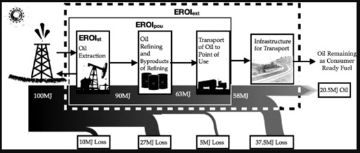
Figure 2 – Various Energy Return on Investment (ERoI) boundaries expressed pictorially (Hall et. al 2013)
This can also be expressed in formula terms as shown in Hall et al. (2009);
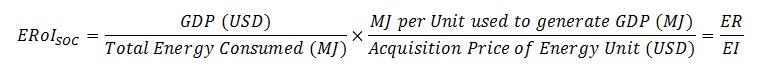
Lambert et al. (2013) provide a further ERoI methodology that seeks to analyse the ERoI of entire nation states. They call this the Societal ERoI (ERoISOC). The ERoISOC numerator, Energy Return (ER), is composed of a nation’s Gross Domestic Product (in USD) multiplied by the Mega Joule (MJ) per unit of energy used to generate that GDP. The denominator, Energy Investment (EI), the energy invested to produce the energy output, is composed of the total energy consumed by that nation in a given year (in MJ) multiplied by dollars per unit spent in the acquisition of that fuel. I’m assuming that the methodology has been derived in this manner because financial data is more readily available than energy data. Expressed in formula;
3. Why Should ERoI Concern Us?
In Lambert et al.’s same paper, entitled “Energy, ERoI and Quality of Life”, they chart a number of indices against both Societal Energy Return on Investment (ERoISOC) and energy consumed per capita. These indexes include the Human Development Index (used by the United Nations to determine life expectancy, education and living standards), female literacy rates, gender inequality and % of children under 5 years old who are underweight. In order to maintain these indices at levels currently observed in developed nations the paper demonstrates that a minimum ERoISOC of 20:1 is required along with a minimum energy consumption of 120 Giga Joules per capita per annum. As a point of reference the UK consumed 125.06 GJ per capita in 2013. Should the ERoISOC for the United Kingdom fall below 20:1 and the energy consumed per capita per annum fall below 120 GJ then we should expect living standards to decline.
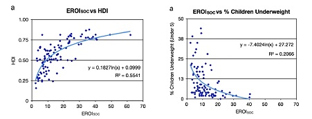
Figures 3 & 4 – ERoISOC plotted against both Human Development Index (HDI) and % of children under 5 years old who are underweight (Lambert et. al 2013)
4. ERoI Data
Given the target ERoISOC figure of 20:1 it is worth listing how our current energy sources perform. I have provided data from Raugei and Leccisi (2015) as their paper presents the range of electricity generation technologies deployed in the United Kingdom. The table is used for indication purposes only as the values within are by no means a consensus (see Hall et al. 2013). In fact, Raugei and Leccisi vastly overstate the ERoI for solar photovoltaic cells when compared to the EROIEXT analysis of Ferroni and Hopkirk (2016).
| Electric Energy Source |
ERoI – Raugei and Leccisi |
| Coal |
3.6# |
| Natural Gas Combined Cycle |
14 |
| Nuclear |
30 |
| Hydroelectric |
58 |
| Wind |
18 (off-shore), 17 (on-shore) |
| Solar (PV) |
8.6* |
# Note: The UK generated just 2% of its electricity in the first half of 2017 from coal.
* Note: Solar photovoltaic systems perform poorly in areas of moderate insolation (which includes the United Kingdom). A comprehensive study by Ferroni and Hopkirk (2016), together with a defence of their original assessment, Ferroni et al. (2017), concludes that solar photovoltaic systems currently deployed in European countries north of the Swiss Alps are actually an energy sink with an ERoIEXT of 0.82:1.
As a means of comparison I have also included the Thermal ERoI for Oil and Gas (World) and Coal (US & Australia) from Hall et al. (2013). The purpose is to illustrate how efficient fossil fuels perform when consumed directly (e.g. inside internal combustion engines) as opposed to conversion into electricity. It should also be questioned as to whether or not environmental factors are included in the figures below.
| Thermal Energy Source |
ERoI – Hall et al. |
| Coal (US & Australia) |
46 |
| Oil and Gas (World) |
20 |
Of further importance to this analysis is that only 14.2% of the energy that the United Kingdom consumes comes in the form of electricity. Most of our energy sources are consumed directly, e.g. petroleum in car engines and natural gas in boilers and cookers.
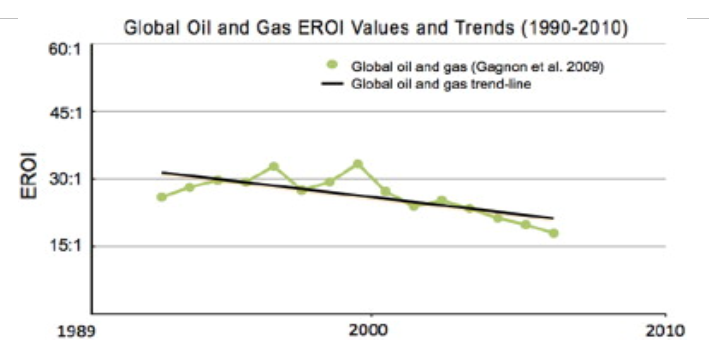
It is not the purpose of this paper to paint one source of energy in a more favourable light than any other. Although hydrocarbon fuels have traditionally been higher quality energy sources compared with most renewables Hall et al. (2013) show a declining ERoI trend for Global Oil and Gas which peaked prior to the millennium before trending downwards (Figure 5).
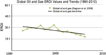
Figure 5 – Global Oil and Gas ERoI Values and Trends (1990 – 2010), (Hall et al. 2013)
Reviewing the younger Norwegian Oil Fields confirms the trend – global oil and gas ERoI is in decline (Figure 6).
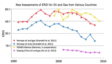
Figure 6 – ERoI Values from Various Countries (1990 – 2010), (Hall et al. 2013)
This declining trend poses challenges for our high ERoI societal demands. With the pivot from fossil fuels to renewable energy clearly in focus it must be understood how shifting from our traditionally reliable, high ERoI sources to intermittent, low ERoI sources will impact the quality of life in the United Kingdom. The graph I have produced below from BP’s Statistical Review of World Energy June 2016 highlights global consumption of energy by type (Figure 7). The purpose is to demonstrate how reliant our current living standards are on fossil fuel consumption and the potential impacts a transition to renewal energy might impose. (Note: I have separated hydro-electric from renewables to better represent current electricity generation from wind, solar, tidal and biomass);
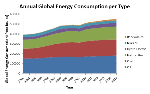
Figure 7 – Annual Global Energy Consumption per Type of Energy Source (Source: BP Annual Review)
To further cement the relationship between ERoI and living conditions the table below provides some examples from the Lambert et al. (2013) paper. It is a list of nation states matched against their corresponding ERoISOC;
| Nation State |
EROISOC |
| Brazil |
18:1 |
| Mexico |
13:1 |
| Pakistan |
5:1 |
| Nigeria |
4:1 |
5. Sustainable Societies
One might ask the question, “Why is a high ERoI important for high living standards?” The answer is simply that the surplus energy must be used to run the economy. That is, it must provide hospitals, medicine, safe drinking water, edible food, clothes, houses, law enforcement, prisons, pensions, transportation links, cancer research, education, electronic goods and so on.
Hall et al. (2009) ask the question, “What is the minimum ERoI that a Sustainable Society must have?” and conclude the following, “Of course the 3:1 minimum ‘extended EROI’ that we calculate here is only a bare minimum for civilization. It would allow only for energy to run transportation or related systems, but would leave little discretionary surplus for all the things we value about civilization: art, medicine, education and so on.”
Lambert et al 2013 adapted Maslow’s hierarchy of needs by mapping each level against a corresponding ERoI value (Figure 8). The values for the first three levels; Extract Energy, Refine Energy and Transportation are measured. The remaining values are estimates taken from Charles A.S. Hall’s Energy Return on Investment – Lecture Notes in Energy, 2017 (ISBN 978-3-319-47820-3).
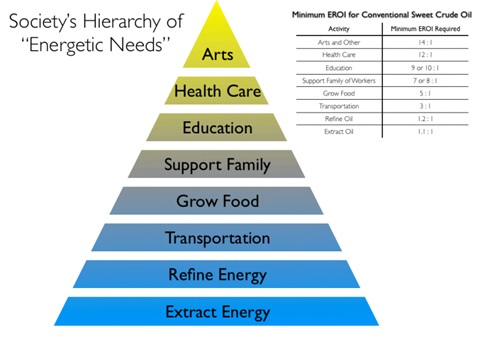
Figure 8 – Maslow’s Hierarchy of Needs adapted by Lambert et al. 2013
6. Alternative Measurements to ERoI
It is reasonable to expect challenges to the importance of ERoI in determining Energy Policy. One common challenge to the ERoI methodology is that future Energy Policy should focus on the monetary cost of alternative sources. In determining suitable energy sources for exploitation it is believed that the trending dollar costs ought to be the key metric. For example, the 2017 International Renewable Energy Agency (IRENA) Rethinking Energy paper makes the claim that “Since 2009, the prices for solar PV modules and wind turbines have fallen by up to 80% and 40% respectively.”
However, this follows the 2008 Global Financial Crisis which triggered deflation in the G7 nations – often referred to as the ‘Credit Crunch’ as private credit plateaued. This had the effect of decreasing the value of all commodities priced in US dollars including the world’s master resource, oil. Figure 9 from the Federal Reserve Bank of St. Louis shows the US dollar cost per barrel of oil from 1990 to 2016. Particular attention should be drawn to the period between 2007 and 2015 where the cost of oil dropped from a high of $130 per barrel to below $40 per barrel. This has the effect of lowering the cost of oil dependent products including photo-voltaic modules and wind turbines.

Figure 9 – Cost of Brent Crude Oil priced in US Dollars from 1990 – 2016 (Federal Reserve Bank of St. Louis)
As can be seen, using private credit stagnation and the resulting commodity price deflation as a metric to exaggerate efficiencies in solar panel and wind turbine production falsely represents the benefits that solar and wind power offer to society.
Another claim, made in the Executive Summary of DNV-GL’s 2017 Energy Transition Outlook paper, declares that energy use will ‘decouple’ from Gross Domestic Product due to accelerating energy efficiencies on a global scale – mostly through renewable sources. Figure 10 shows how the paper represents this graphically with the decoupling occurring in 2016.
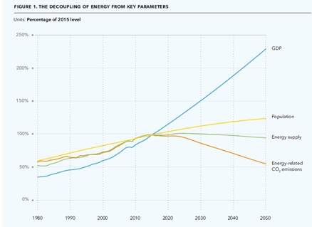
Figure 10 – A graph showing a GDP metric (global or regional?) decoupling from energy supply (DNV-GL)
Prior to 2016, DNV-GL’s position agrees with the position supported in this paper – i.e. that GDP and energy consumption are highly correlated. Figures 11 and 12 clearly show the correlation between higher energy consumption and higher GDP. Figure 11 compares global GDP to global energy consumption from 1969 to 2013 whereas Figure 12 plots the energy each nation state consumed against its GDP for the year 2000.
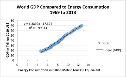
Figure 11 – Global GDP vs Global Energy Consumption 1969 – 2013 (Gail Tverberg)

Figure 12 – National GDP vs National Energy Consumption in 2000 (American Physics Society using Energy Information Administration data)
By making the case that GDP will ‘decouple’ from energy consumption due to global efficiencies it also implies that the following statement is true, “because energy consumption and GDP did not decouple at any point between 1969 and 2013 no global energy efficiency was realised”. Perhaps the authors of DNV-GL’s Energy Transition Outlook are unaware of the global switch from incandescent light bulbs to energy saving LED lighting…
The claim made in the DNV-GL Energy Transition Outlook paper ought not to pass without scrutiny – to quote, “Over the last few decades, we have seen developed countries succeed in decoupling economic growth from increased energy use.” Would it raise an eyebrow if this paper were to declare that the longevity of Homo Sapiens had decoupled from oxygen intake? The issue here is what we mean by the term ‘growth’. Typically it is defined as Gross Domestic Product (GDP) which is a measure of all the goods and services a nation state produces within a given timeframe. However, this measurement does not give context to the debt structure which underpins it. Currently, the G7 nations have a combined debt burden (public and private) of $92.855 Trillion – this figure is derived from the Bank for International Settlements database comprising of credit to general government and credit to private non-financial sector from all sectors. Figure 13 shows the steady increase in debt necessary to sustain this alleged ‘growth’, doubling from $46.436 Trillion in 2000 to $92.855 Trillion at the end of 2016.

Figure 13 – Combined Public and Private Debt of G7 Nations since 2000. Public debt is defined as ‘Credit to General Government from All Sectors’. Private debt is defined as ‘Credit to private non-financial sector from all sectors – households, non-profit institutions serving households and private non-financial corporations’. (Source: BIS total credit statistics.)
The purpose of reviewing common alternatives to the ERoI methodology is to highlight just how damaging they can be to Energy Policy decisions. By using ERoI as a foundation for Energy Policy we can be assured that our measuring stick remains constant, i.e. we are simply measuring Joules in vs Joules out to determine quality. This will allow the United Kingdom to develop a robust and efficient Energy Policy.
7. Energy Systems
If those who determine the United Kingdom’s Energy Policy are convinced as to the importance of energy quality the next step is to define a method for addressing the problem. Energy availability and distribution is fundamentally a systems problem. Our most basic model, the ecological system, is a relationship between biotic and abiotic components. Biotic components, such as plants and bacteria, interact with abiotic components, such as water, light and radiation. Biotic components that are able to secure an adequate abiotic surplus are able to reproduce, whereas those which do not become extinct.
The energy system of Homo Sapiens’ civilisation is much more complex. Not only must we secure an abiotic surplus to survive we also require access to abstract agreements such as debt, crop enhancers such as fertilisers and a vast distribution network in the form of transportation links and power lines. Therefore, whenever we talk about power distribution systems we are really talking about debt, energy and infrastructure. Without these components none of it works. Whilst it is beyond the scope of this paper to analyse the components of industrialised civilisation in further detail it is clear that energy distribution is a systems problem.
It is within the scope of this paper, however, to recommend a number of actions that, if undertaken, would ensure that the United Kingdom utilised the highest quality of energy sources available. With that goal in mind Energy Policy could be used as a tool to improve both the reporting mechanism for energy quality and enforce a minimum ERoI threshold that each energy source shall meet before acceptance for national distribution. The purpose of this is to ensure that the power distribution network complies with the observations referenced in this paper – chiefly that high ERoI energy sources result in a higher standard of living. This would be achieved as follows;
- Determine a universal method for ERoI calculations which incorporates all energy inputs
- Ensure energy providers accurately report ERoI figures to the Regulator
- Set a minimum ERoI figure for acceptance by the national power distribution network
- Penalise energy suppliers which supply the national power distribution network using energy sources which fall below this ERoI value
If Energy Policy cannot prevent low quality energy sources from being made available to the national power distribution network then we must give serious examination to the effects upon society that a lower ERoI powered system will cause.
8. Conclusion
From the data presented in this paper it is clear that the quality of our traditional energy sources are in decline and that renewable sources aimed to replace them are of even lower quality. With our high standard of living dependent upon high quality energy sources the need to accurately measure ERoI has never been greater. Systems analysis should be used to define the boundaries of ERoI analysis to provide a universal point of reference as a means of comparing various energy sources. Once established, this can be used to assess the quality of the energy sources available to the United Kingdom’s power distribution network. It may well be the case that the UK cannot attain an ERoISOC of 20:1. If that is the case we must engage in serious discussions about the implications to society and pay particular attention to the functions that a lower ERoI can afford.


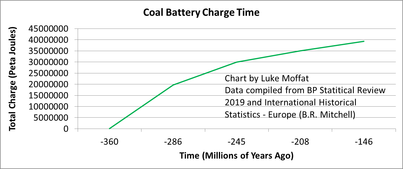 Figure 1 – Coal Battery Charge Time (approximation)
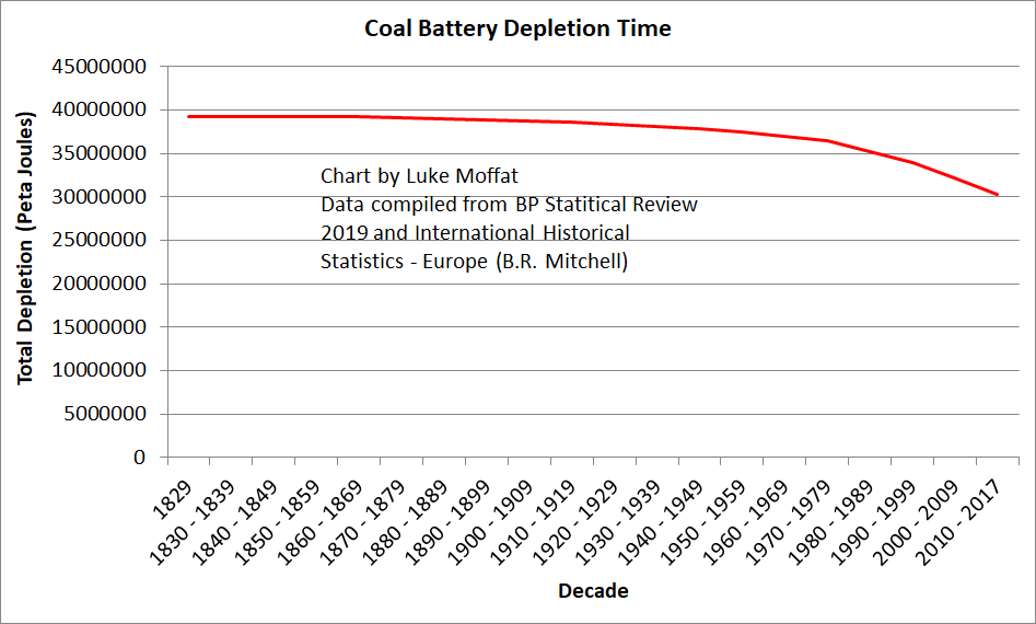 Figure 2 – Coal Battery Depletion Time (approximation)
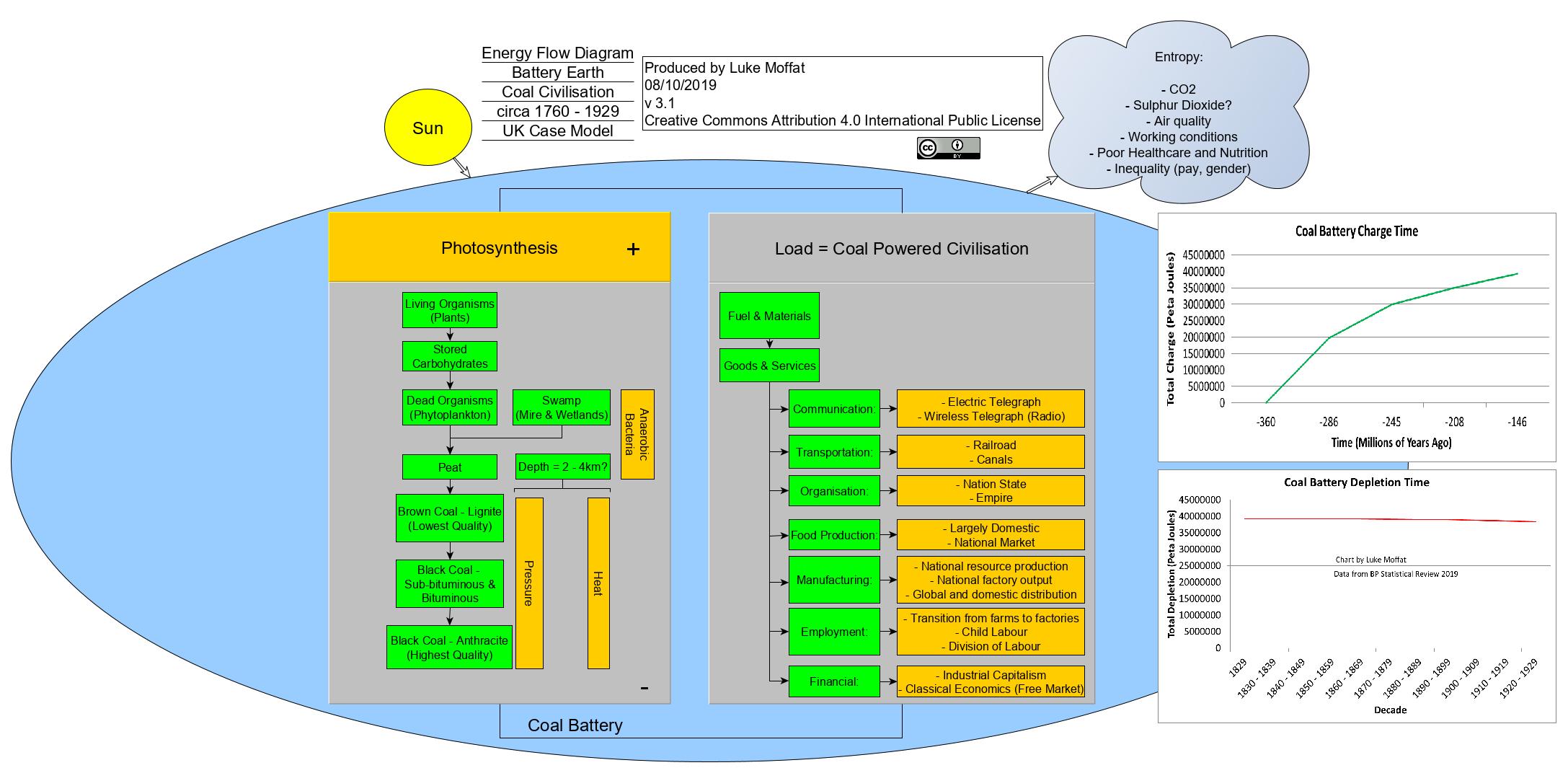 Figure 3 – Coal Civilisation – (Please see PDF for a readable version –
  Figure 4 – Fossil Fuel Civilisation (Please see PDF for a readable version –
  Figure 5 – Fossil Fuel & “Renewable” Civilisation (Please see PDF for a readable version
  Figure 6 – Total German Debt (Public and Private)
 Figure 7 – German Battery (Energy Consumed by Type over Time)
 Figure 8 – Finnish Battery (Energy Consumed by Type over Time)
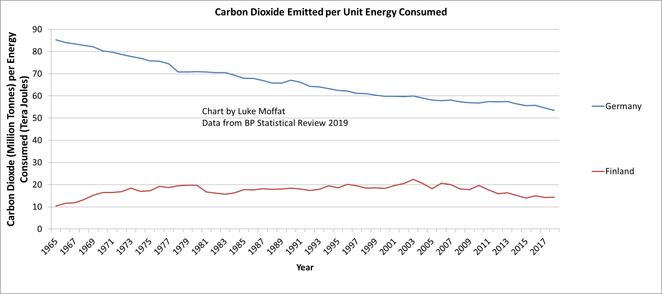 Figure 9 – German and Finnish Battery when measured by Carbon Dioxide Emitted per Unit Energy Consumed
 Chart 1 – UK Energy Consumption per Capita per Annum (1965 – 2017). Energy data from BP Statistical Review 2018. Population data from the UN.