
First of all I’d like to take this opportunity to correct a minor grievance. The term ‘Brexit’ has always bothered me as Northern Ireland does not form part of Great Britain. In the interests of inclusivity shouldn’t the short-hand term for the United Kingdom’s retreat from the EU be ‘UKwit’? Anyway, as I said, it’s a minor grievance and one that I won’t lose too much sleep over.
What might, however, bring about a degree of restlessness is the United Kingdom’s declining energy consumption per capita when we compare 2017 to the period prior to 2005. And, in particular, how this underpins the debate surrounding the UK’s continued membership in the EU. So consider yourselves thoroughly forewarned as to where this is heading.
UK Contributions to EU Budget
Let’s begin with an overview of what the European Union is and how it works. The European Union consists of twenty-eight member states (as listed here). Nineteen of those twenty-eight member states use the Euro as their official currency which is collectively known as the Eurozone. Furthermore, there is a region referred to as the Schengen Area;
“The Schengen Area is one of the greatest achievements of the EU. It is an area without internal borders, an area within which citizens, many non-EU nationals, business people and tourists can freely circulate without being subjected to border checks. Since 1985, it has gradually grown and encompasses today almost all EU countries and a few associated non-EU countries.”
As a member of the EU (but neither the Euro nor the Schengen Area), the UK contributes to the EU budget. The total UK contribution to the EU budget in 2014 was EUR 11,341 million (inclusive of the UK rebate correction). This EUR 11,341 million contribution was spent on some of the following;
- EUR 1,098.6 million on Competitiveness (More developed regions)
- EUR 748.4 million on Horizon 2020
- EUR 544.5 million on Regional convergence (Less developed regions)
- EUR 149 million on EU administration costs
- EUR 71.1 million on European territorial cooperation
- EUR 51.3 million on Decentralised Agencies
- EUR 48.1 million on Euratom Research and Training Programme
- EUR 37.1 million on European satellite navigation systems (EGNOS and GALILEO
- EUR 20.7 million on Asylum and Migration Fund (AMF)
- EUR 11.2 million on European Earth Observation Programme (Copernicus)
- EUR 11.1 million on Creative Europe
The items listed above total EUR 2,791.1 million.
UK tax income in 2013 – 2014 was £505.8 billion (here), equating to approximately EUR 629 billion at average annual exchange rate of 1.244. The EU expenditures listed above equate to 0.44% of the UK’s 2013-2014 tax revenue.
UK Energy Consumption
It would be hard to argue that this expense incurred by the UK is a significant strain on the public purse in a growing economy. However, it is the latter part of that statement, ‘growing economy’, that I wish to draw attention to. As we saw in the previous post a growing economy is a derivative of growing energy consumption. Yet, it would be erroneous to assume that this growth applied equally to everyone. Viewing the economy through the lens of the UK’s Energy Consumption per Capita (Chart 1) offers an alternative view of this otherwise rosy picture.
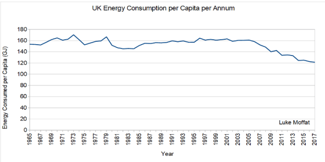 Chart 1 – UK Energy Consumption per Capita per Annum (1965 – 2017). Energy data from BP Statistical Review 2018. Population data from the UN.
On an energy consumed per capita basis the UK economy began its decline after 2005 having held the 160GJ line for a decade. This decline has not been offset through efficiency gains in energy utilisation which could otherwise claim to boost economic output through lower energy consumption. The following two charts help explain why;
- The UK’s energy consumption consists mostly of oil and gas (Chart 2)
- The global ERoI trend for oil and gas is in decline (Chart 3)

Chart 2 – Total UK Energy Consumption by Type. Energy data from BP Statistical Review 2018

Chart 3 – Global Oil and Gas ERoI Values and Trends (1990 – 2010), (Hall et al. 2013)
What we are looking at is a continued dependence on fossil fuels to run the UK economy whilst the quality of those same fossil fuels is diminishing. Add to that a rising population (Chart 4) and declining energy consumption (Chart 2) and we end up with reduced energy consumption per capita (Chart 1) not on an efficiency basis but on an affordability basis (Chart 5). In summary, adding more people to the UK economy since 2005 has not boosted economic growth per capita – instead it has eroded economic growth per capita.

Chart 4 – UK Population (1970 – 2015). Population data from the UN.

Chart 5 – Energy Spend as a Percentage of Total Household Expenditure (1993 – 2016). Chart from https://www.ofgem.gov.uk/data-portal/energy-spend-percentage-total-household-expenditure-uk
UK Energy Production
So far we have only talked about UK energy consumption. Lets now look at UK energy production. Chart 6 captures UK energy production from 1970 to 2017. It clearly captures the ‘boon’ North Sea oil and gas has had on the UK’s energy production, beginning c.1974 and peaking in 1999 for oil and 2000 for gas. Next I want to illustrate what than means to the UK’s domestic production versus domestic consumption. A positive value in Chart 7 indicates that the UK lives ‘within its energy means’ whereas a negative value means that the UK has to rely on energy imports to fund its lifestyle.

Chart 6 – UK Annual Energy Production by Type (1970 – 2017). Data from BP Statistical Review 2018
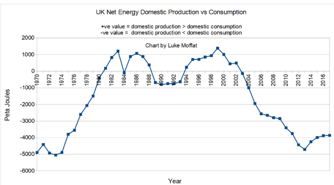
Chart 7 – UK Net Energy Domestic Production versus Consumption (1970 – 2017). Data from BP Statistical Review 2018.
Now we have two problems;
1) The UK is producing energy of diminishing quality
2) The UK doesn’t produce enough energy to remain energy independent.
As a point of interest, even during the miners strike of 1984 the UK energy situation didn’t look as perilous as it does today.
So What?
Why should any of this concern us? And why should it make the UK’s membership in the EU untenable?
With the UK’s declining domestic oil and gas production, combined with lower oil and gas prices, lets see what that does to UK tax revenue from North Sea oil and gas (Chart 8);
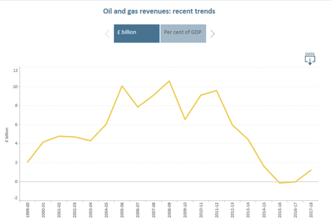
Chart 8 – UK Tax Revenue from UK Oil and Gas Production taken from Office for Budget Responsibility (Source of data: Office for National Statics) (https://obr.uk/forecasts-in-depth/tax-by-tax-spend-by-spend/oil-and-gas-revenues/)
The OBR explains the decrease in tax revenue as follows;
“The fall in receipts has been driven by falling production, much lower oil and gas prices and higher tax-deductible expenditure. The rate of petroleum revenue tax and the supplementary charge have also been cut substantially.”
This £10 billion loss in oil and gas tax revenue represents 1.9% of the UK’s tax income in 2013 – 2014 of £505.8 billion. Or, put another way, the entirety of the UK’s financial contribution to the EU budget for 2014.
Now lets look at UK private debt on a per capita basis (Chart 9) as further proof of the UK’s declining prosperity;
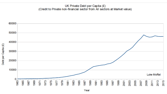
Chart 9 – UK Private Debt per Capita in GBP (1963 – 2015). Financial data from Bank for International Settlements. Population data from the UN.
Perhaps I should have begun this article with Chart 9 as I assume people are more attuned to rising debt per capita than declining energy consumption per capita as a tell-tale sign for declining prosperity. The reason I didn’t do this is because the origins of our problem are energy related. As explained in the previous article, energy is the economy. To elaborate further an economy has four fundamental stages;
1) Creation phase
2) Extraction phase
3) Processing phase
4) Transportation phase
1) The creation phase is how a material comes into being, whether that be wheat grown on a farm or iron ejected from dying stars.
2) The extraction phase is how Homo Sapiens capture a particular good whether it be scything wheat or mining iron.
3) The processing phase is how Homo Sapiens turn that particular good into something useful, whether that be grinding wheat into flour and then baking the flour into bread or smelting iron into tools.
4) The transportation phase is how Homo Sapiens transport the processed product to market for sale or exchange.
Energy is involved in each of these four steps. If you remove energy from any of the steps above the whole economy collapses. The more energy available to an economy the more products that economy can produce. The more surplus energy available to that economy the more additional services it can offer. So why should it surprise us that declining energy consumed per capita, without a corresponding rise in energy quality, indicates a decline in prosperity? The financial implications of this are reinforced when we compare UK domestic energy production to private debt per capita. The UK’s energy production ‘double peak’ of 1983 – 1986 to the trough of 1994 is met with an 150% increase in private debt per capita over the same period. The UK energy production peak of 1999 to the trough of 2013 is met with an 100% increase in private debt per capita over the same period. That leads us to the conclusion that in order to offset the decline in energy prosperity the people of the UK are resorting to private debt. Reviewing Chart 6 we shouldn’t be surprised if financial conditions in the UK revert to those of 1970. In short, selling another level of administration to a country experiencing a severe contraction in prosperity is a tall order – especially if that same administration doesn’t even notice the underlying problem.
